公式FAQより。
Q.各APIの利用制限を教えてください。
A.1デベロッパーIDにつき、1秒に1回以下のリクエストとしてください。
ふむふむ。
公式FAQより。
Q.各APIの利用制限を教えてください。 A.1デベロッパーIDにつき、1秒に1回以下のリクエストとしてください。
ふむふむ。
めも。
下記の通り範囲が異なる。
■FLOAT
-3.402823466E+38 ? -1.175494351E-38
0
1.175494351E-38 ? 3.402823466E+38
■DOUBLE
-1.7976931348623157E+308 ? -2.2250738585072014E-308
0
2.2250738585072014E-308 ? 1.7976931348623157E+308
file_get_contents()などでページのコンテンツを取得しにいく際、日本語ドメインをそのまま渡すとエラーになってしまうため、ピュニコードに変換してやる必要がある。
調べるとPEARのライブラリを利用することで簡単に実現可能な模様。
下記URLからライブラリをダウンロードして任意の位置に配置した後、「Net/IDNA2.php」をrequireすれば使用可能。
http://pear.php.net/package/Net_IDNA2/download
以下例。
require_once 'Net/IDNA2.php';
$punycode = Net_IDNA2::getInstance();

$encode = $punycode->encode('日本語ドメイン.com');
$decode = $punycode->decode('xn--eckwd4c7c5976acvb2w6i.com');
これで暗号化と復号化が可能。
実験コードは下記の通り。
// time()
$start = microtime(true);
for($i = 0; $i <= 100000000; $i++) {
	time();
}
$end = microtime(true);
$r = $end - $start;
var_dump($r);

// $_SERVER['REQUEST_TIME']
$start = microtime(true);
for($i = 0; $i <= 100000000; $i++) {
	$_SERVER['REQUEST_TIME'];
}
$end = microtime(true);
$r = $end - $start;
var_dump($r);
結果は下記の通り。
float(20.367789983749)
float(13.140978097916)
結果:$_SERVER[‘REQUEST_TIME’]を参照するほうが速い。
※けどほぼ気にする必要無いレベル。
ローディングアニメーション第2弾。
マークアップは下記の通り。
■HTML
<div class="stage-2">
<span>Loading...</span>
<span class="l-1"></span>
<span class="l-2"></span>
<span class="l-3"></span>
<span class="l-4"></span>
<span class="l-5"></span>
<span class="l-6"></span>
</div>
■CSS
.stage-2 {
  font-family: meiryo;
  background: #fff;
  width: 200px;
  height: 100px;
  margin: 0 auto;
  padding: 100px 0 0 100px;
}
span {
	display: block;
	margin: 0 auto;
}

span[class*="l-"] {
	height: 4px; width: 4px;
	background: #000;
	display: inline-block;
	margin: 12px 2px;

	border-radius: 100%;
	-webkit-border-radius: 100%;
	-moz-border-radius: 100%;

	-webkit-animation: loader 4s infinite;
	-webkit-animation-timing-function: cubic-bezier(0.030, 0.615, 0.995, 0.415);
	-webkit-animation-fill-mode: both;
	-moz-animation: loader 4s infinite;
	-moz-animation-timing-function: cubic-bezier(0.030, 0.615, 0.995, 0.415);
	-moz-animation-fill-mode: both;
	-ms-animation: loader 4s infinite;
	-ms-animation-timing-function: cubic-bezier(0.030, 0.615, 0.995, 0.415);
	-ms-animation-fill-mode: both;
	animation: loader 4s infinite;
	animation-timing-function: cubic-bezier(0.030, 0.615, 0.995, 0.415);
	animation-fill-mode: both;
}

span.l-1 {-webkit-animation-delay: 1s;animation-delay: 1s;-ms-animation-delay: 1s;-moz-animation-delay: 1s;}
span.l-2 {-webkit-animation-delay: 0.8s;animation-delay: 0.8s;-ms-animation-delay: 0.8s;-moz-animation-delay: 0.8s;}
span.l-3 {-webkit-animation-delay: 0.6s;animation-delay: 0.6s;-ms-animation-delay: 0.6s;-moz-animation-delay: 0.6s;}
span.l-4 {-webkit-animation-delay: 0.4s;animation-delay: 0.4s;-ms-animation-delay: 0.4s;-moz-animation-delay: 0.4s;}
span.l-5 {-webkit-animation-delay: 0.2s;animation-delay: 0.2s;-ms-animation-delay: 0.2s;-moz-animation-delay: 0.2s;}
span.l-6 {-webkit-animation-delay: 0;animation-delay: 0;-ms-animation-delay: 0;-moz-animation-delay: 0;}

@-webkit-keyframes loader {
	0% {-webkit-transform: translateX(-30px); opacity: 0;}
	25% {opacity: 1;}
	50% {-webkit-transform: translateX(30px); opacity: 0;}
	100% {opacity: 0;}
}

@-moz-keyframes loader {
	0% {-moz-transform: translateX(-30px); opacity: 0;}
	25% {opacity: 1;}
	50% {-moz-transform: translateX(30px); opacity: 0;}
	100% {opacity: 0;}
}

@-keyframes loader {
	0% {-transform: translateX(-30px); opacity: 0;}
	25% {opacity: 1;}
	50% {-transform: translateX(30px); opacity: 0;}
	100% {opacity: 0;}
}

@-ms-keyframes loader {
	0% {-ms-transform: translateX(-30px); opacity: 0;}
	25% {opacity: 1;}
	50% {-ms-transform: translateX(30px); opacity: 0;}
	100% {opacity: 0;}
}
かっこいいのを見つけたのでメモ。
マークアップは下記の通り。
■HTML
<div class="stage">
<div class='loader'>
  <div class='circle'></div>
  <div class='circle'></div>
  <div class='circle'></div>
  <div class='circle'></div>
  <div class='circle'></div>
</div>
</div>
■CSS
.stage {
  background: #111;
  width: 300px;
  height: 250px;
  margin: 0 auto;
}
.loader {
  position: relative;
  padding-top: 100px;
  width: 40px;
  margin: auto;
}
.loader .circle {
  position: absolute;
  width: 38px;
  height: 38px;
  opacity: 0;
  -webkit-transform: rotate(225deg);
  -webkit-animation-iteration-count: infinite;
  -webkit-animation-name: orbit;
  -webkit-animation-duration: 5.5s;
}
.loader .circle:after {
  content: '';
  position: absolute;
  width: 5px;
  height: 5px;
  border-radius: 5px;
  background: #fff;
  /* Pick a color */
}
.loader .circle:nth-child(2) {
  -webkit-animation-delay: 240ms;
}
.loader .circle:nth-child(3) {
  -webkit-animation-delay: 480ms;
}
.loader .circle:nth-child(4) {
  -webkit-animation-delay: 720ms;
}
.loader .circle:nth-child(5) {
  -webkit-animation-delay: 960ms;
}
@-webkit-keyframes orbit {
  0% {
    -webkit-transform: rotate(225deg);
    opacity: 1;
    -webkit-animation-timing-function: ease-out;
  }
  7% {
    -webkit-transform: rotate(345deg);
    -webkit-animation-timing-function: linear;
  }
  30% {
    -webkit-transform: rotate(455deg);
    -webkit-animation-timing-function: ease-in-out;
  }
  39% {
    -webkit-transform: rotate(690deg);
    -webkit-animation-timing-function: linear;
  }
  70% {
    -webkit-transform: rotate(815deg);
    opacity: 1;
    -webkit-animation-timing-function: ease-out;
  }
  75% {
    -webkit-transform: rotate(945deg);
    -webkit-animation-timing-function: ease-out;
  }
  76% {
    -webkit-transform: rotate(945deg);
    opacity: 0;
  }
  100% {
    -webkit-transform: rotate(945deg);
    opacity: 0;
  }
}
■デモ
めも。
$bool = property_exists($myClass, 'propertyName');
変数の有無がブーリアンで返却される。
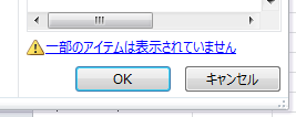
通常空白セルのみを抽出する方法としてはオートフィルターがよく用いられるが、
フィルタリング後の項目が1万種類を超えるとそれ以降が省略されてしまうため、
空白セルのみをチェックして表示することができなくなる。
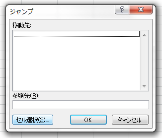
この場合、空白セルを選択して削除するためには下記の方法を取る必要がある。
1, まずは対象の行全体を選択する。
2, その状態で「F5」キーを押す。
3, 下のようなウィンドウが現れるので、左下の「セル選択」を押す。
4, 項目中の「空白セル」を選択し、「OK」を押す。
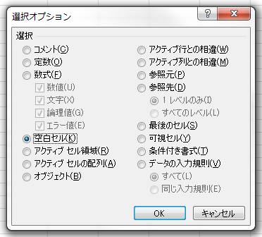
5, 選択列中の空白セルが全て選択された状態になるので、その中の一つを右クリックし、削除を選択する。
6, 削除の際に、「行全体」を選択することで1行まるまる消え去るため、オートフィルターと同等の効果を得ることが出来る。
業務上、数十万件を超えてくるのが当たり前なのでこれは非常に助かる機能。